
My Macro Master Dashboard
Monday, October 13th, 2025

Over the weekend, I put together a dashboard for myself to use.
In this article I am going to explain how it works and what we are seeing, I aim to continue improving my value provision and I will just keep getting better, I assure you. So stick with me and lets get into it.
Here we have the first panels, the main area of the dashboard.
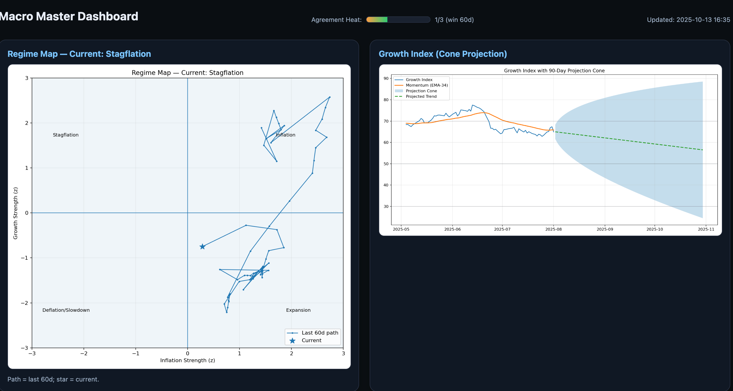
The regime map is based on the one MarketRadar uses and created.
It shows which regimes we have been in over the last 60 days, the path it took, and where we are now.
The growth index shows the trend in Growth, one of the 3 main drivers (Inflation, Growth, Liquidity).
The signal is simply the 34 ema, anyone could create something like this as I have just shown you, the difference is, most won’t even try.
The cone projection is very simple and not meant to be accurate, it’s just meant to give an idea of the trend.
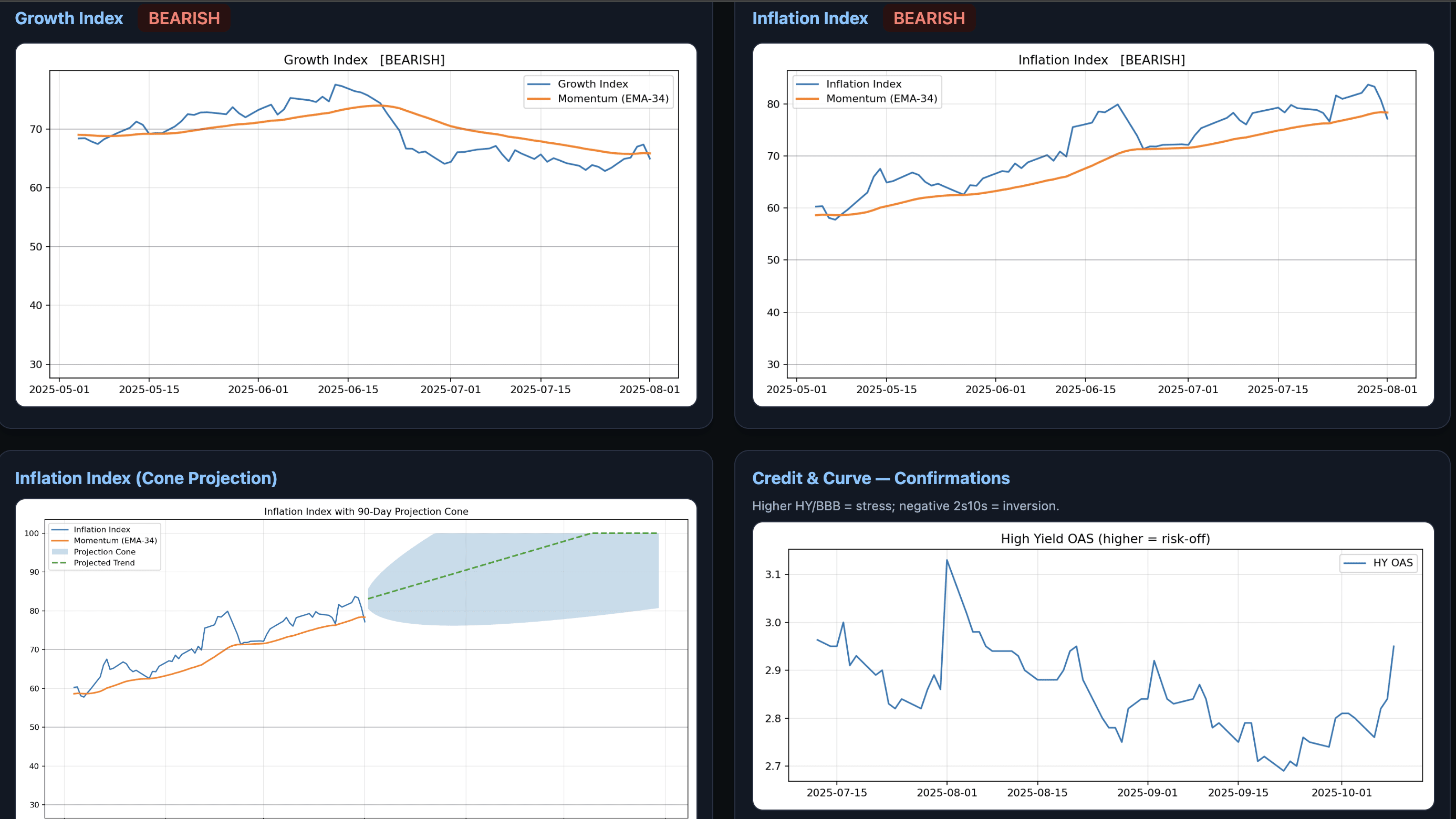
Here we can see the growth index again without it’s “projections” just a plain chart, same with the inflation index and inflation index cone projection. Same ideas there as before.
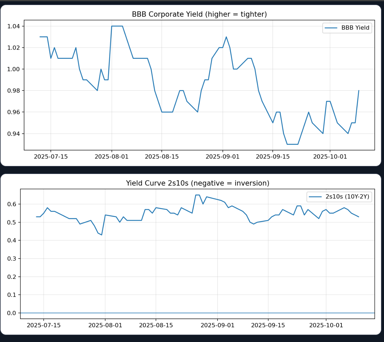
I’ve also included credit on the dashboard, HYOAS and BBBOAS, as well as the 2s10s curve for added confluence as credit is extremely important to the macro cycle.
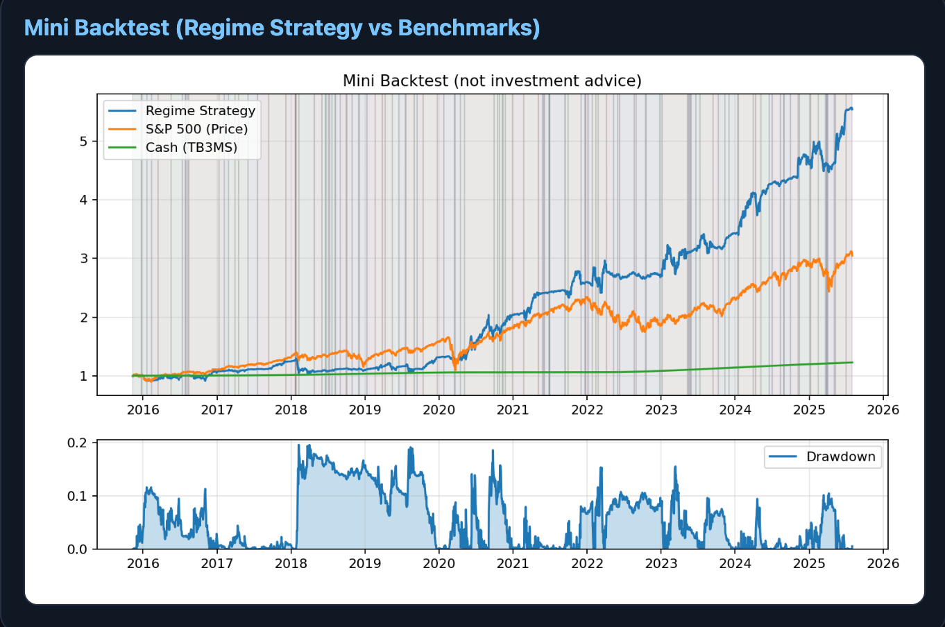
Here we have the backtest and performance of this dashboard over the last 10 years.
As you can see, it has GREATLY out-performed the S&P 500, by almost DOUBLE.
The strategy is based on the ratio of assets:cash in each of the four regimes.
For example in a stagflationary regime maybe you’d be 25% long risk assets, with 75% cash to buy dips and protect yourself.
Great post. Now this is value, well done.
Thanks for sharing. Curious how do you calculate the growth and inflation indices? Is it simply calculated off GDP and CPI?